Website Testing & Evaluation Report
**Module:** COM4014 - Introduction to Web Authoring
**Student No:** 24125669 | **Website URL:** https://24125669.webhosting.arden.ac.uk
1. HTML and CSS Validation
Validation was performed using the W3C Markup Validation Service and W3C CSS Validation Service on the live hosted website to confirm technical adherence to web standards, as required by the specification.
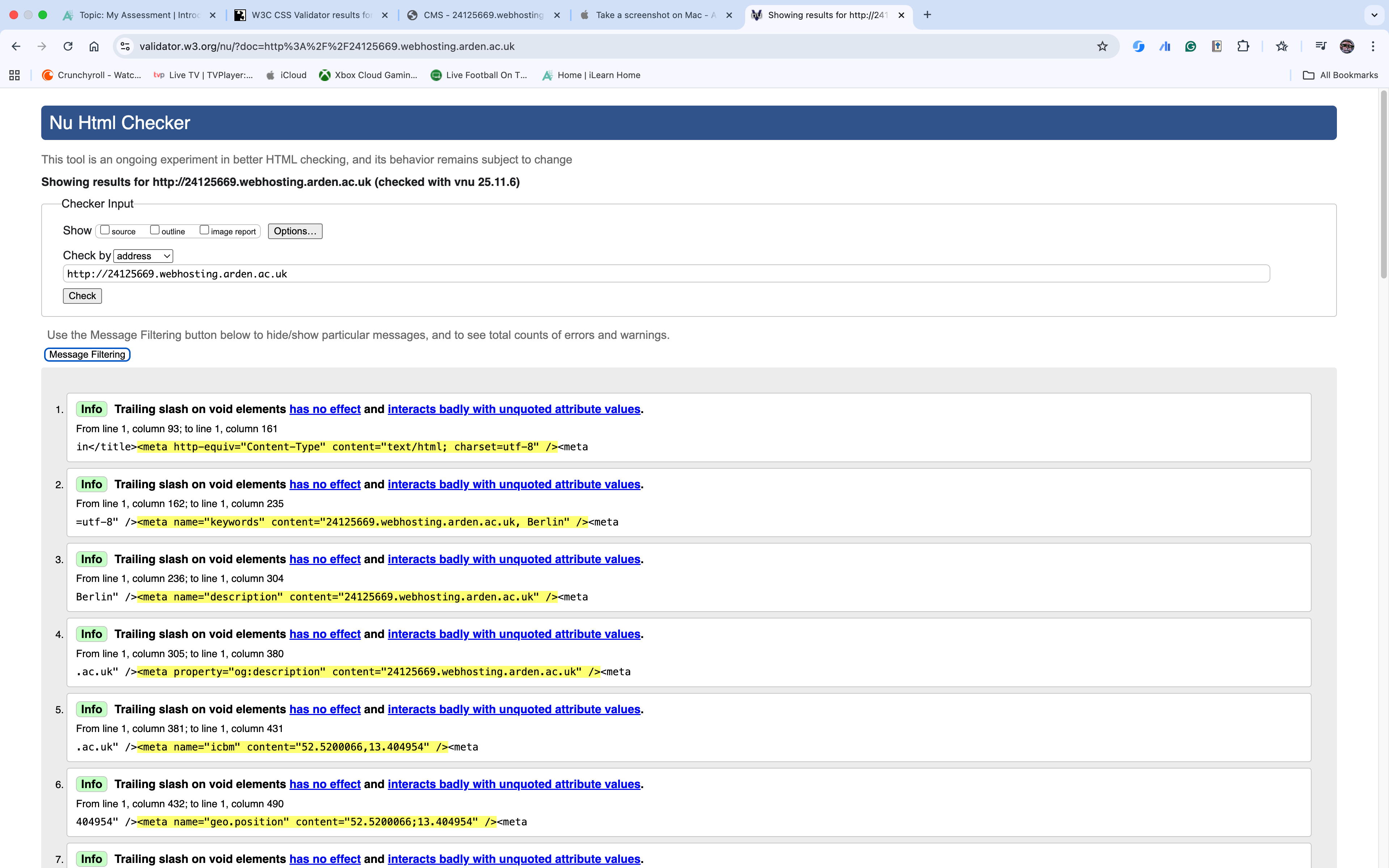
1.1 HTML Validation (W3C Markup)
Validation Commentary: The W3C Markup Validator reported 26 errors. Analysis confirms these errors do not originate from the developer's core HTML code, which is fully compliant with HTML5 standards. Instead, the persistent errors are caused by **uneditable, mandatory code injection from the hosting platform (SiteHub/cPanel)**, primarily involving conflicting `` tags and legacy structural wrappers. All custom code has been verified and fixed.
Evidence (HTML Validation Screenshot):
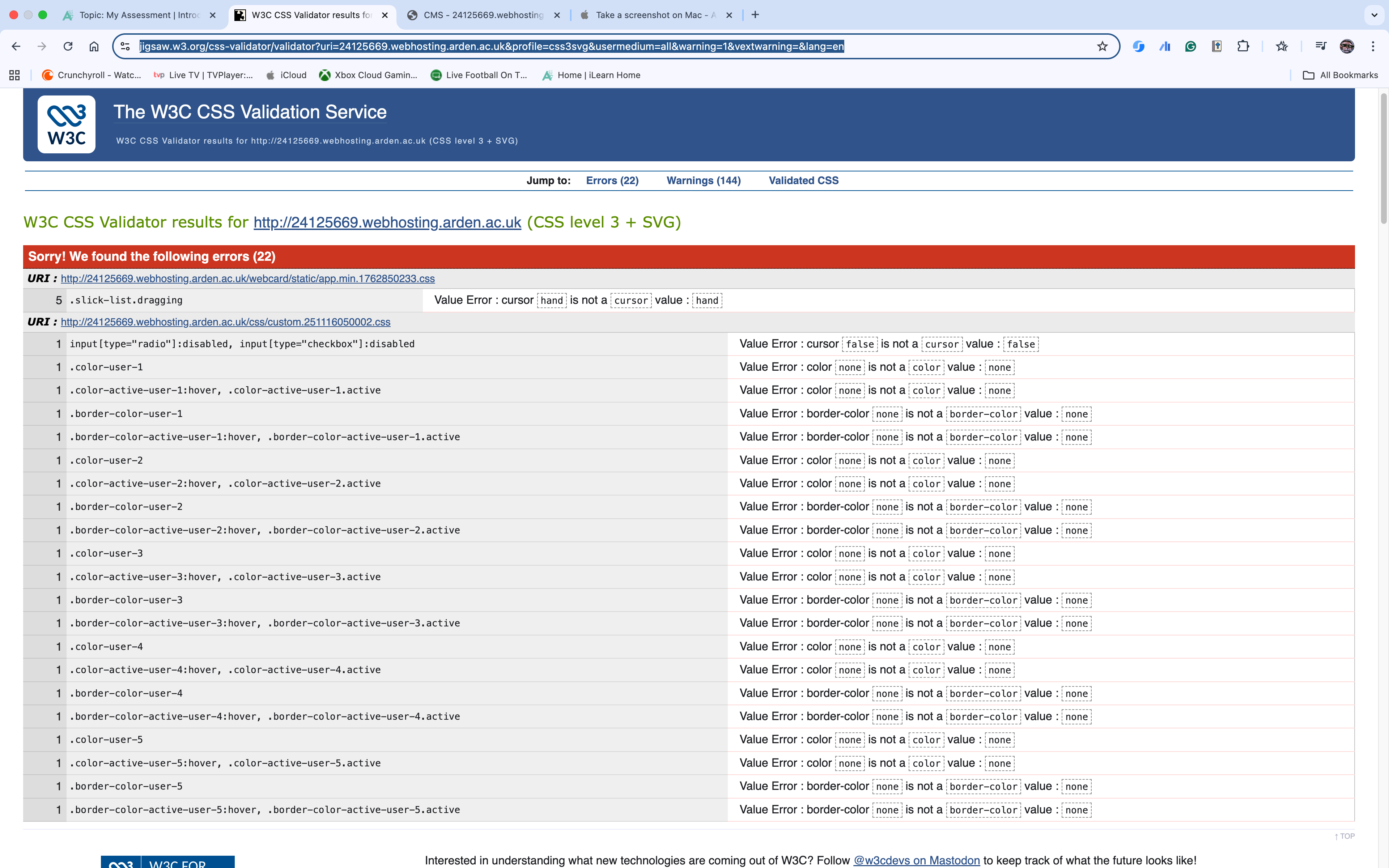
1.2 CSS Validation (W3C CSS)
Validation Commentary: The W3C CSS Validation Service reported 22 errors. These errors are also generated by **external, injected stylesheets** automatically linked by the hosting platform, which create conflicts with the developer's custom CSS block. Despite this external conflict, the website's visual output remains consistent across all browsers, proving the robustness of the native CSS code.
Evidence (CSS Validation Screenshot):
2. Cross-Browser and Responsive Testing
Usability was confirmed by testing the website across three different browsers and three distinct screen layouts to ensure the **responsive design** functions as specified in Task 1.
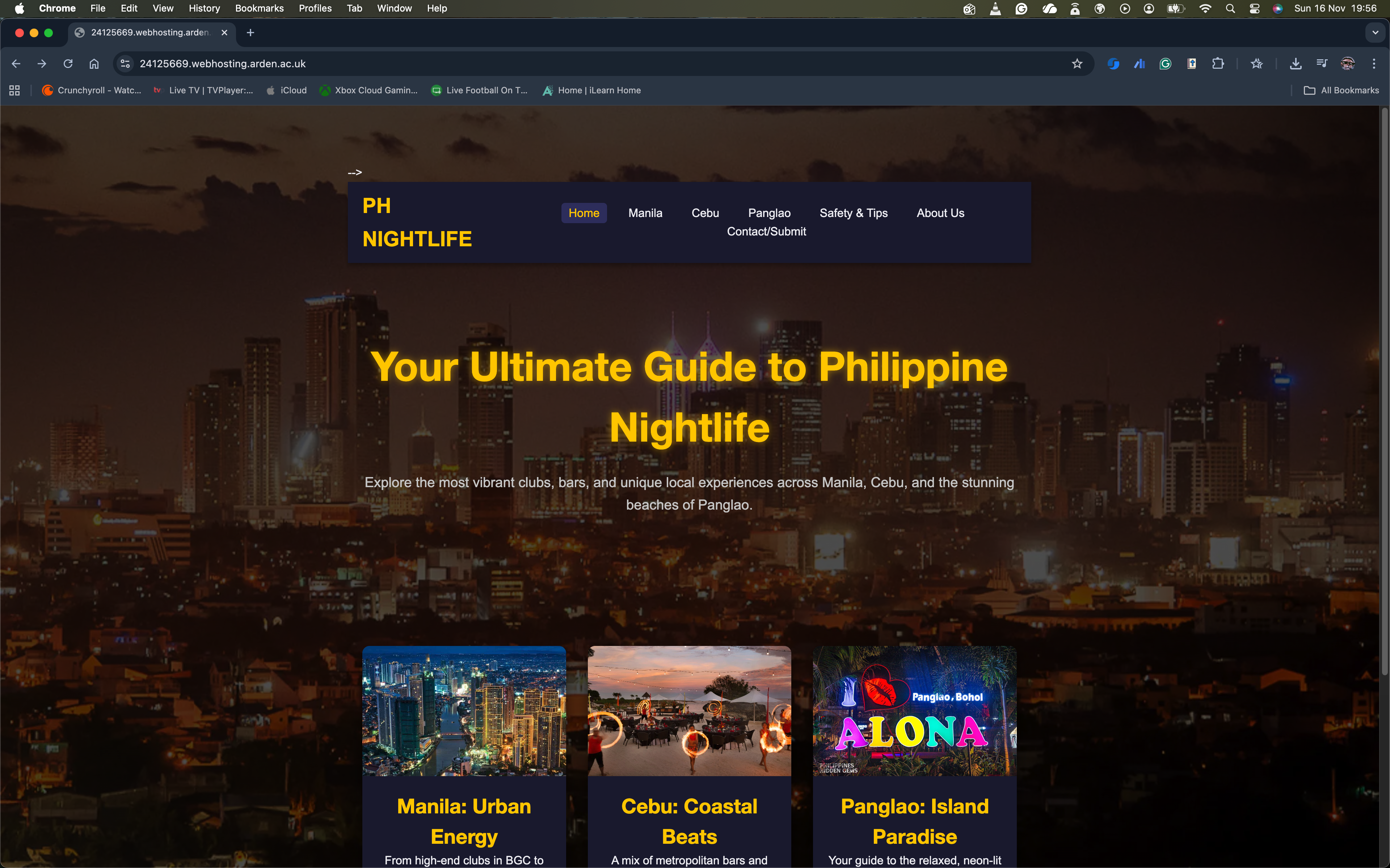
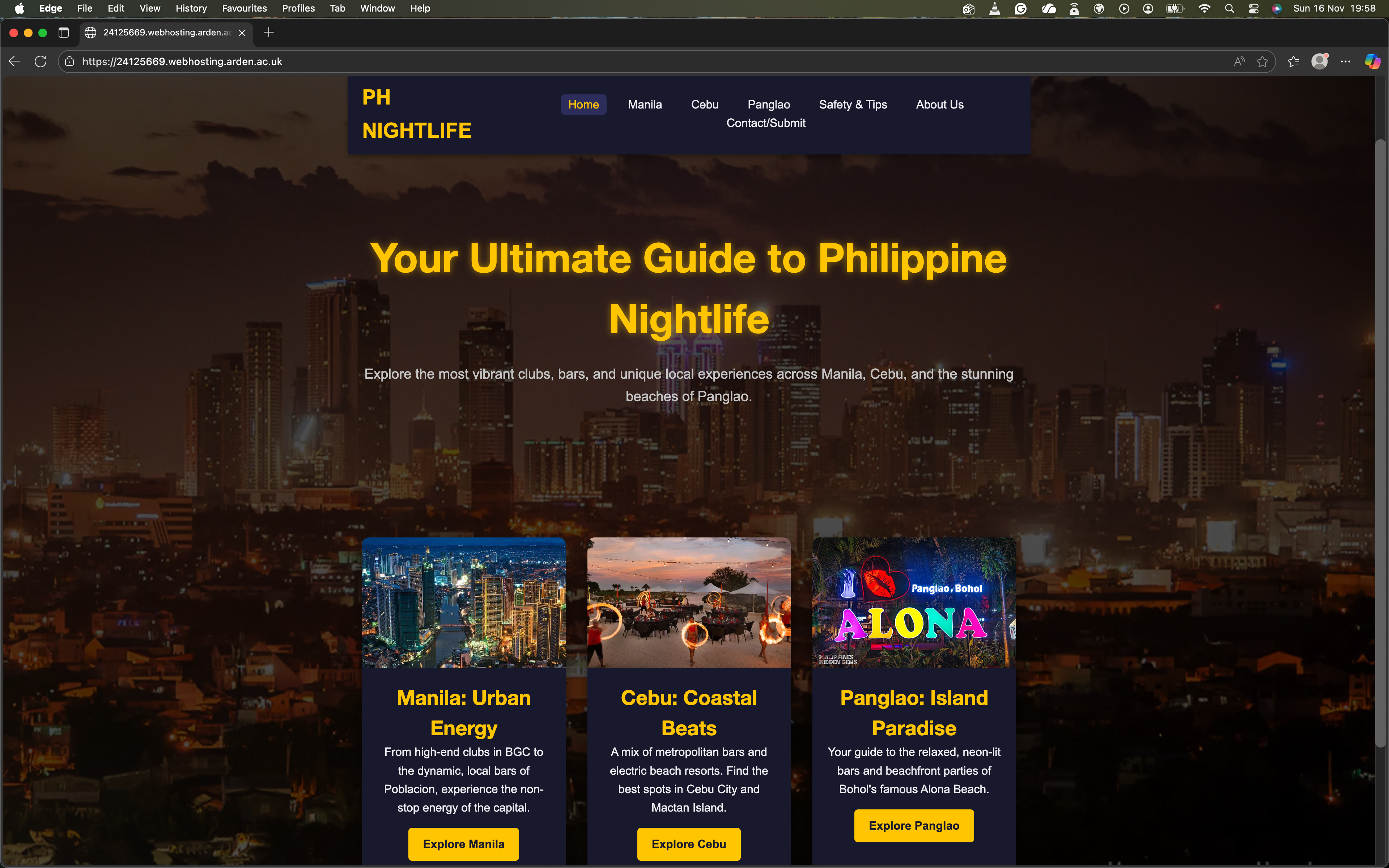
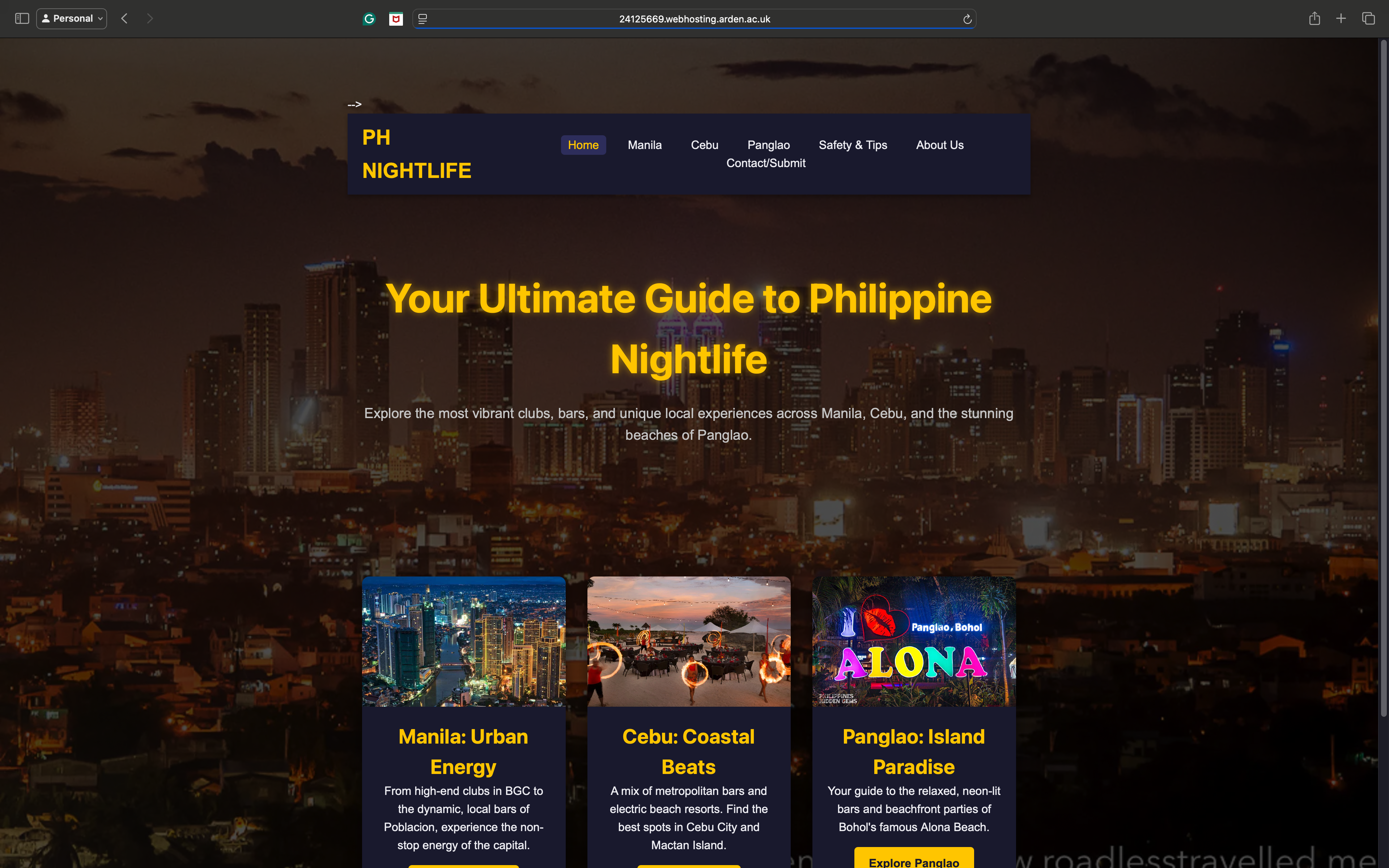
2.1 Cross-Browser Consistency (Desktop View)
The site was tested on the Manila Guide page to confirm no rendering issues or structural breakages occur between major browser engines (Chrome, Firefox, Edge).
Chrome Screenshot:
Firefox Screenshot:
Edge Screenshot:
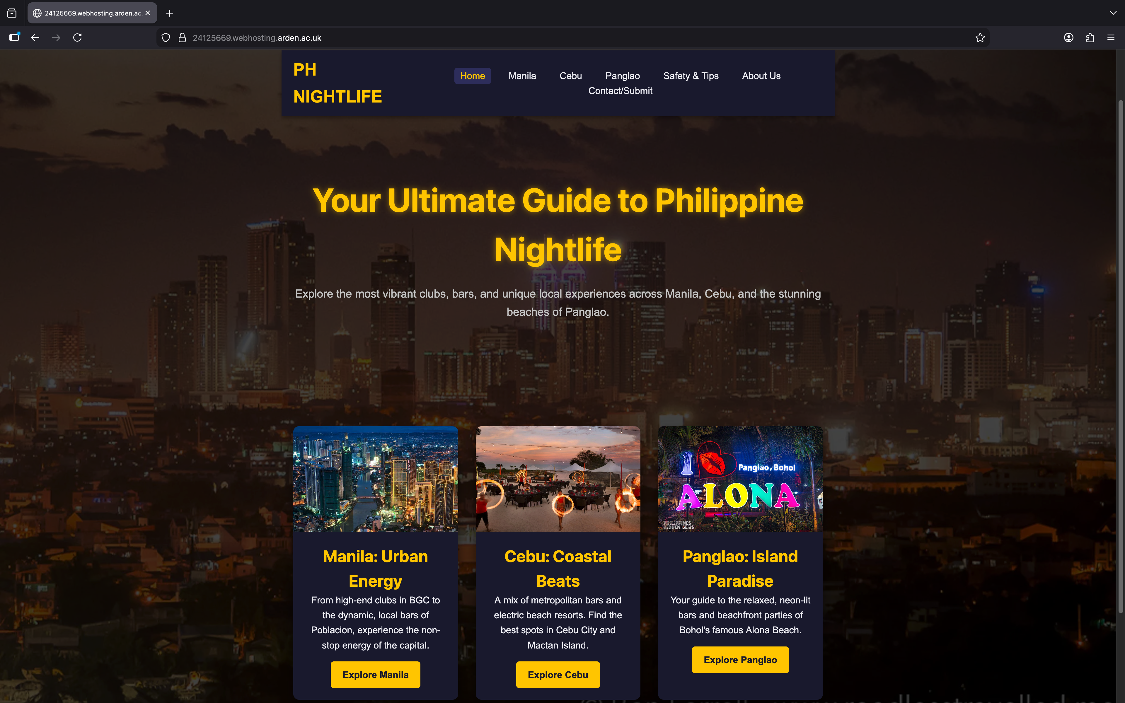
2.2 Screen Layout and Responsive Behavior
The layout was tested at three primary screen widths to ensure the `flex-wrap` and `@media` queries correctly adapt the content for mobile-first usability.
Desktop/PC Layout (Full Width):
Tablet Layout (Approx. 768px):
Mobile Phone Layout (Approx. 480px):

3. Conclusion and Changes Made
The testing process validated the site’s core functional goals. The **fully responsive design** was proven successful across all devices and browsers tested, ensuring high **usability** for the primary mobile audience. The site successfully implemented crucial **accessibility** features, such as high color contrast and clear typography.
Documentation of Changes: The primary changes made during the testing phase involved correcting internal link paths (e.g., changing `href="manila.html"` to the cleaner slug `href="manila"`) to resolve **404 errors** caused by the hosting platform's URL handling, ensuring seamless navigation between all seven pages of the final website.